How To - Calibrating Touchscreen Monitors
Customer orders are displayed in the kitchen using a standard format. This format contains key information for kitchen and wait staff.
Example order windows are shown below:
-
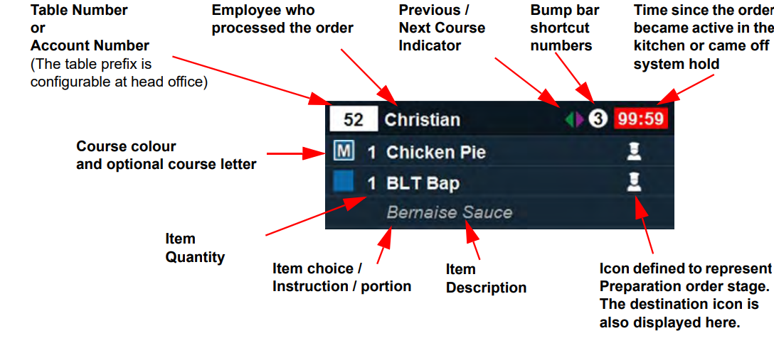
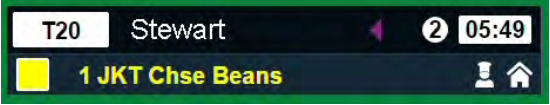
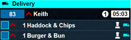
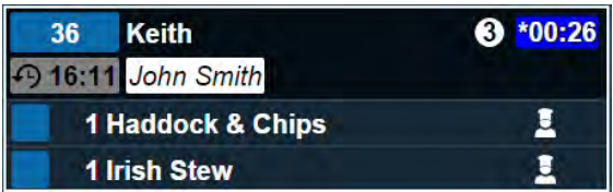
The top left corner of every customer order displays the table number, or if the customer is not at a numbered table, the account number will be displayed.
The table number is shown in a white box with the number prefixed (by default) with T and the account number is in a blue box.
The table prefix can be configured to show any character or none at all. -
The name of the employee who first processed this part of the order is displayed at the top of each order ticket.
If a second employee added new items to the account, that employee’s name would be displayed in the header for new tickets created for those new items, but not for existing tickets.
If a third employee added further items to existing tickets (i.e. when adding new mains while the mains ticket is still on system hold), the name would be unchanged. -
The Previous / Next Course Indicator is provided to help the chef understand where the item fits within a customer order.
If a previous course was served to a customer, the colour of the left arrow will be in that course colour.
The right arrow will be the colour of the next course to be served.
These arrows are not displayed if destinations are configured to ignore courses. -
The number in the header surrounded by a white circle is the bump bar shortcut. Pressing the corresponding number on the bump bar will bump this order/item.
-
The time since the order became active in the kitchen or came off system hold is displayed in the top-right corner of the window.
The colour of the surrounding box may change according to the alerts and warnings set up at head office.
Where multiple courses form part of an order, the second/third courses are displayed on the kitchen screen in separate tickets and are on hold until the first course is complete. For example, once the starter has been served, the mains course is released from hold and the timer is reset to zero. -
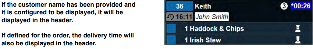
If a delivery time has been defined for the order, it will be displayed beneath the table/account number. The customer name can be displayed beneath the name of the employee processing the order if a customer name has been provided and if it is configured to be displayed.
-
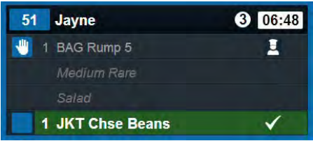
Any item choices or instructions are displayed underneath the item to which they apply as child lines. Portion identifiers are displayed in square brackets.
-
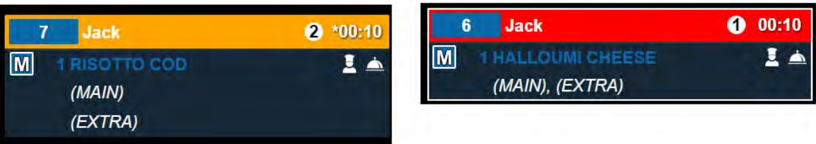
The course colour box makes it easy to identify items from different courses in a list.
This colour is configurable at head office. Head office can also configure a course letter to be displayed in the course colour box.
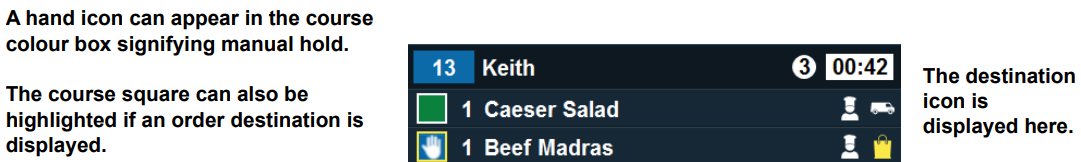
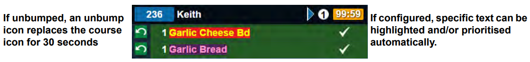
The item name can also be configured to be displayed in the course colour at head office as shown in the example below: - If the item is unbumped, the course colour box is replaced with an unbump icon for 30 seconds to highlight users to this change. The icon on the right-hand side makes it easy to identify the order stage of each item, and is configurable at head office.
-
If an order is put on hold, the On Hold icon will be displayed in the course identifier box and the item details will be greyed out.
As an item progresses through the order stages, the icon will be updated and the highlight colour will change accordingly.
In the example below, the "JKT Chse Beans" item is highlighted in green with a tick icon, signifying that the item is ready to serve. - If configured, order lines that contain specific text can be highlighted and/or prioritised automatically.
Kitchen iQ checks the item name of all parent and child items, recipes and instructions and if it matches a defined text rule, the item will be highlighted and/or prioritised as configured.
If an item matches more than one text rule, the highest ranking rule will be applied. -
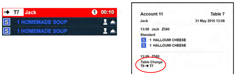
If a customer has moved tables, the order will show the new table number and a table change icon along to warn staff that any orders prepared for the old table need to go to the new one.
Users can select the order to display the details window which also displays the original table number so staff can check where the customer has moved from. - If your organisation has decided that all tickets for a particular order destination should be prioritised, such as you may do for take-away orders from Just Eat or Deliveroo, the priority icon will be displayed in the same way as it is when prioritised manually:
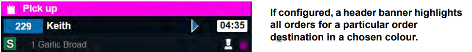
- Head office may also configure an order destination to display a header banner highlighted in a particular colour to draw attention to all orders for a particular order destination.
- If an order spans two or more columns of the display, table split markers are displayed at the bottom and top of
panels.
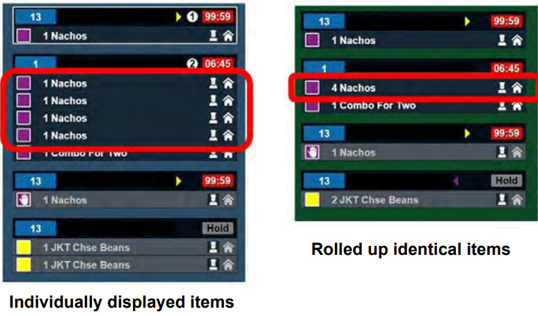
Identical items may be displayed individually (as shown in the left-hand example below) or rolled up (as shown in the right-hand example below), depending on the configuration of the site. - Roll up items adhere to the following rules:
- Items with child lines will only roll up if these are identical.
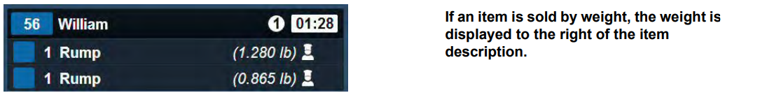
- Weighted items will not roll up.
- Depending on configuration, the same ticket may show rolled up items on one channel and individual items on another channel.
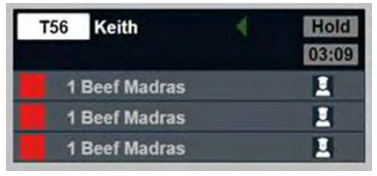
- When the status of a single item in a rolled up order line is changed, this item is unbundled from the
combined order line.
For example, one item can be taken off System Hold whilst the remaining bundled order line remains on System Hold. - Identical items on the same account but with different order destinations are never rolled up.
- Where the quantity of a bundled order line is changed, a blue overlay appears (over the item) to identify this.
Timers
Pending Active Timer
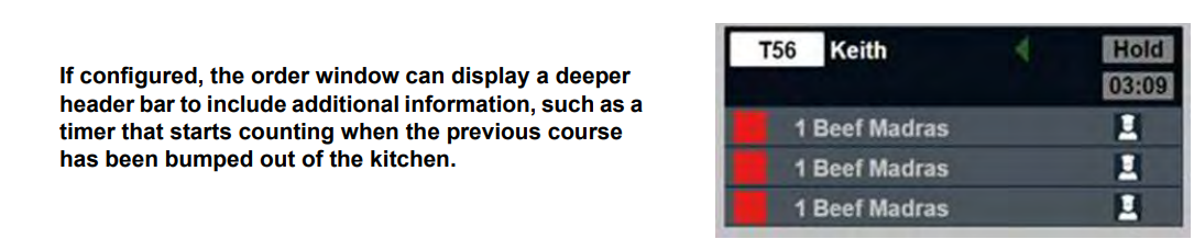
If the pending active timer is activated for your site, a timer will be displayed under the Hold label which will count up from the time that the previous course was bumped out of the kitchen.
The timer disappears once the order becomes active.
Standard Timer
A timer  is displayed in the top right of each order ticket. Either the timer box or the ticket header can be configured
to change colour when the ticket is within the target time or has exceeded it to provide an additional visual indicator
of the length of time the order has been active.
is displayed in the top right of each order ticket. Either the timer box or the ticket header can be configured
to change colour when the ticket is within the target time or has exceeded it to provide an additional visual indicator
of the length of time the order has been active.
For example, it could be one colour for the first 30 seconds to
indicate that it is newly active on the screen, another colour to indicate that it is within the target course or cook
time and a final colour when it has gone past its target course or cook time.
Your head office will advise you whether this is set to target course or cook time.
New items display an asterisk and a blue background. The length of time it remains blue depends on the
current order stage of the item and the length of time configured as the ‘New Duration’.
Alternate Views
Each channel is configured to have a default view. However, users can switch between all the views configured for the channel to change the way information is displayed if an alternative view has been configured at head office.
To exit the alternate view and return to the standard view, press the Back button. 
Panel View
The panel view displays items belonging to an order grouped together on a ticket with the name of the wait staff.
The panel view will display 3 columns on 19" screens and 4 columns on 22" screens.
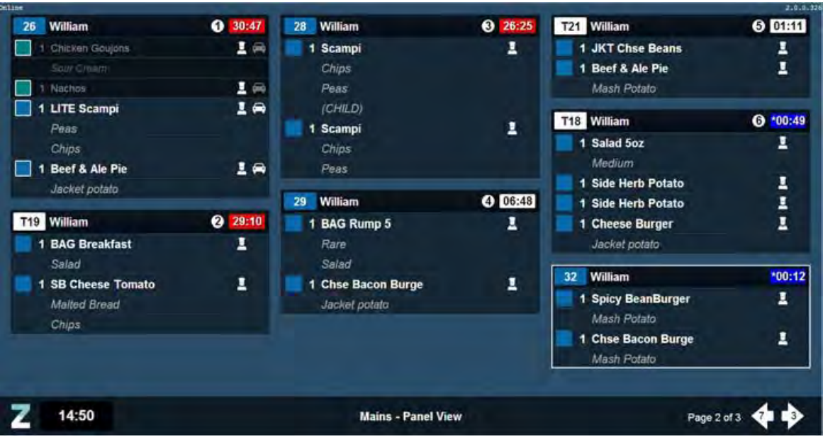
The bump bar shortcut numbers can be used to bump entire orders from the panel view.
If a delivery time has been defined for the order, it will be displayed in the header beneath the table/account
number.
Where the customer name has been provided, and it has been configured to show, it will be displayed in the
header beneath the name of the employee processing the order.
A head office setting controls whether child lines are displayed in individual rows beneath the parent, or comma
separated to save space:
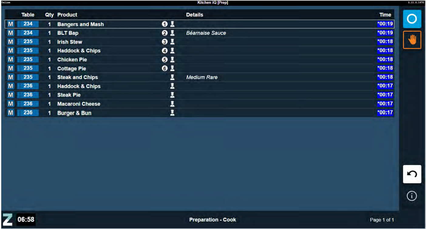
Item View
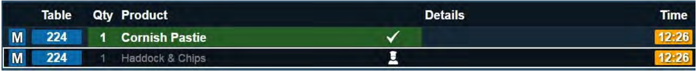
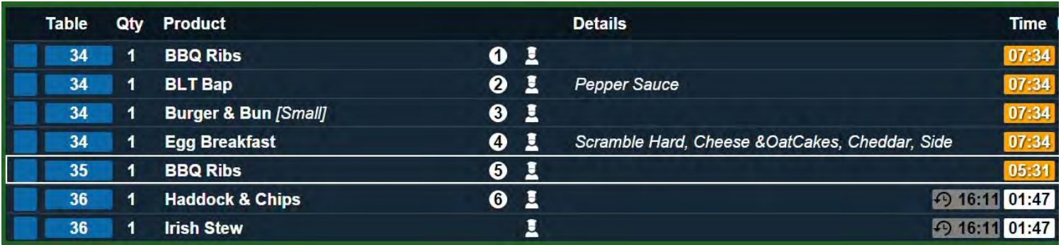
The item view displays a complete list of all individual items.
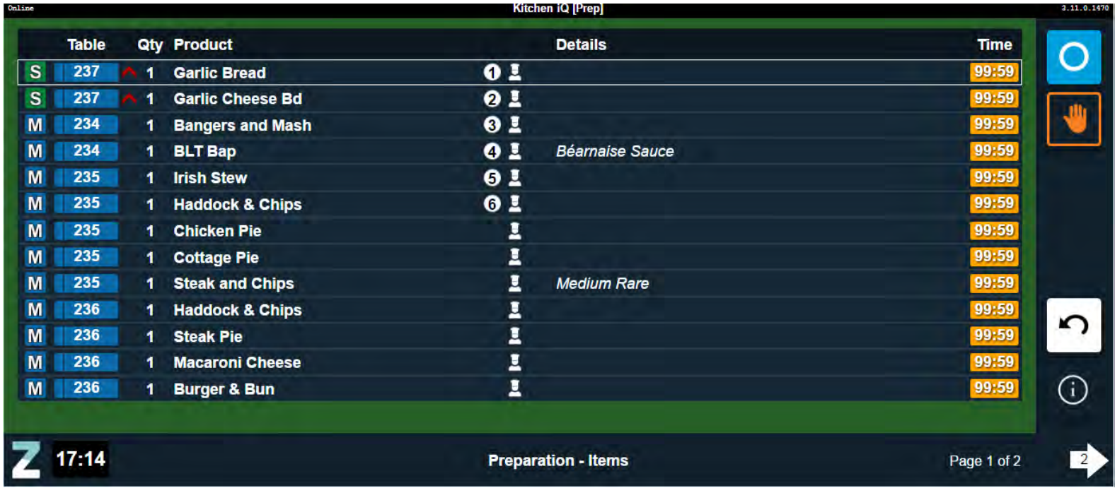
The bump bar shortcut numbers can be used to bump individual items from the list. As items are bumped, the
display of next station will be updated accordingly.
In the example below, the Cornish Pastie is now ready for
serving but the Haddock and Chips is not:
If a delivery time has been defined for the order, it will be displayed in the Details column beside the counter.
Count View
The Count View lists ordered items individually, and separately identifies the number of items of each status type.
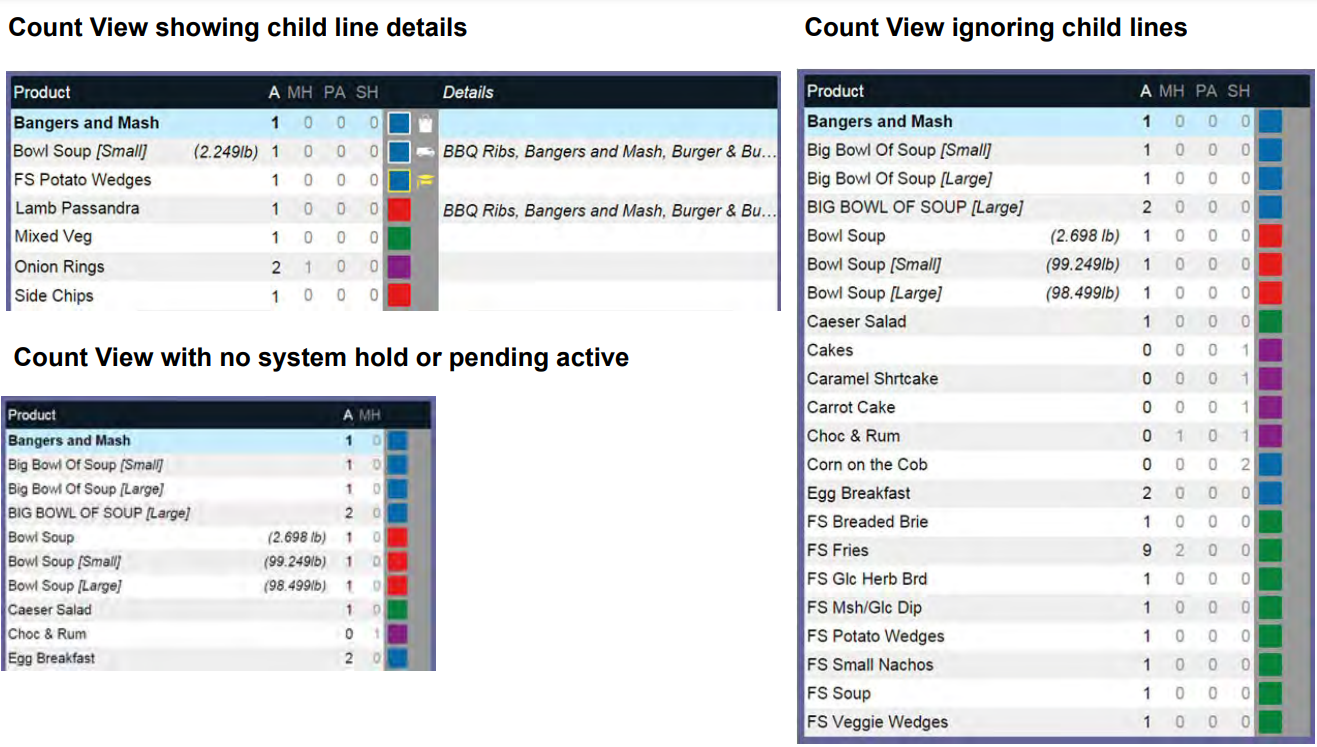
Typical count views are shown below:
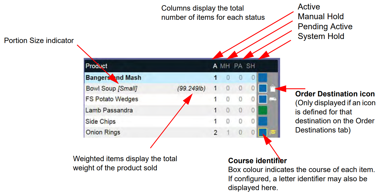
Table View
The table view is a visual representation of the active tables on site. Using a selection of symbols and colour coding, staff can refer to the table view and see instantly all relevant information about each account.
Typical table views are shown below:
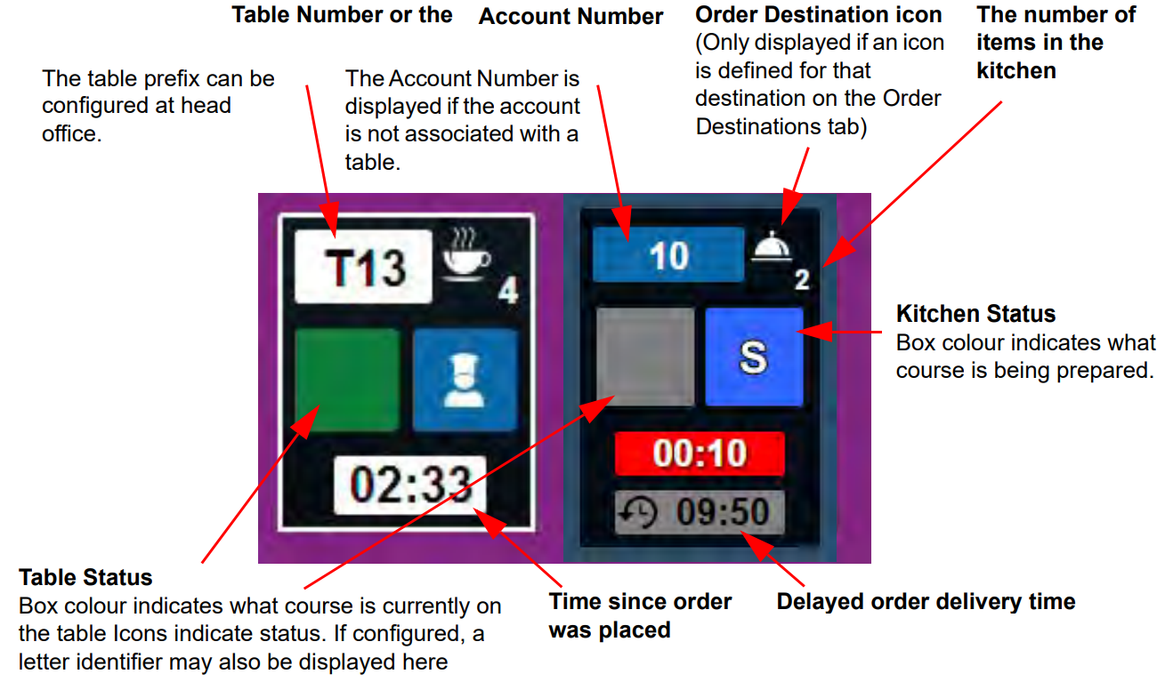
Accounts are displayed on the table view in Table Number then Account Number order.
Accounts are removed from the table view in accordance with the Table View settings defined in the Config application.
The number of items in the kitchen includes items that are on hold, but excludes all order lines that have been cancelled or moved to another account.
The table status box is shown in grey until something from the order line is bumped out of the kitchen. If several courses are bumped simultaneously, the course with the highest position in the Courses tab (as defined in the Config application) is shown. A course letter identifier may be also displayed in the table status box if configured at head office.
The following icons may also be displayed in the table status box depending on the status of the order line.

|
Printer icon | EPoS till has indicated a Bill Printed and Saved status for the account, and the account is not closed. |

|
Closed icon | EPoS till has indicated the account is closed. |
The highest priority icon will be displayed if more than one icon is valid.
The Kitchen Status box is grey until orderlines are in the kitchen. If several courses are being prepared, the course with the highest position in the Courses tab (as defined in the Config application) is shown.
The following icons are displayed in the Kitchen Status box depending on the status of the order line.
Hand icon: An order line in the displayed courses is on manual hold
No icon: All order lines in the displayed course are on system hold
Order Stage icon: If nothing is on hold, an icon indicating the order stage of the least advanced orderline with the displayed course as configured in the Order Stages tab. i.e. Preparation, Assembly, Serving, Delivered icons
The timer displays the time since the course in the Kitchen Status box was ordered or came off system hold. The timer colour changes according to the length of time that has passed. These timings can be defined in the Config application.
When the course is on manual hold, the display will alternate between the time and a HOLD message.
When the course is on system hold, the display will show a HOLD message.
If there are no more courses in the kitchen, the timer will show the time since the last order line was bumped out
of the kitchen.
If a delayed order delivery time is associated with an order, it will be displayed at the bottom of the table view. This
time is displayed in 24 hour format.
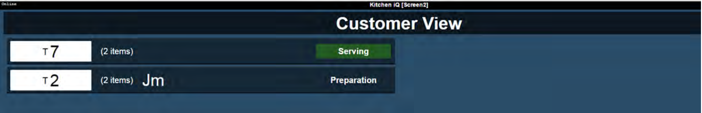
Customer View
The customer view displays a complete list of all active orders in the order they appear in the kitchen and grouped by order stage, i.e. Ready, Assembly and Preparation as shown.
This view is for customers to check on the status of their order and the amount of information is kept to a minimum to allow them to read it from a distance.
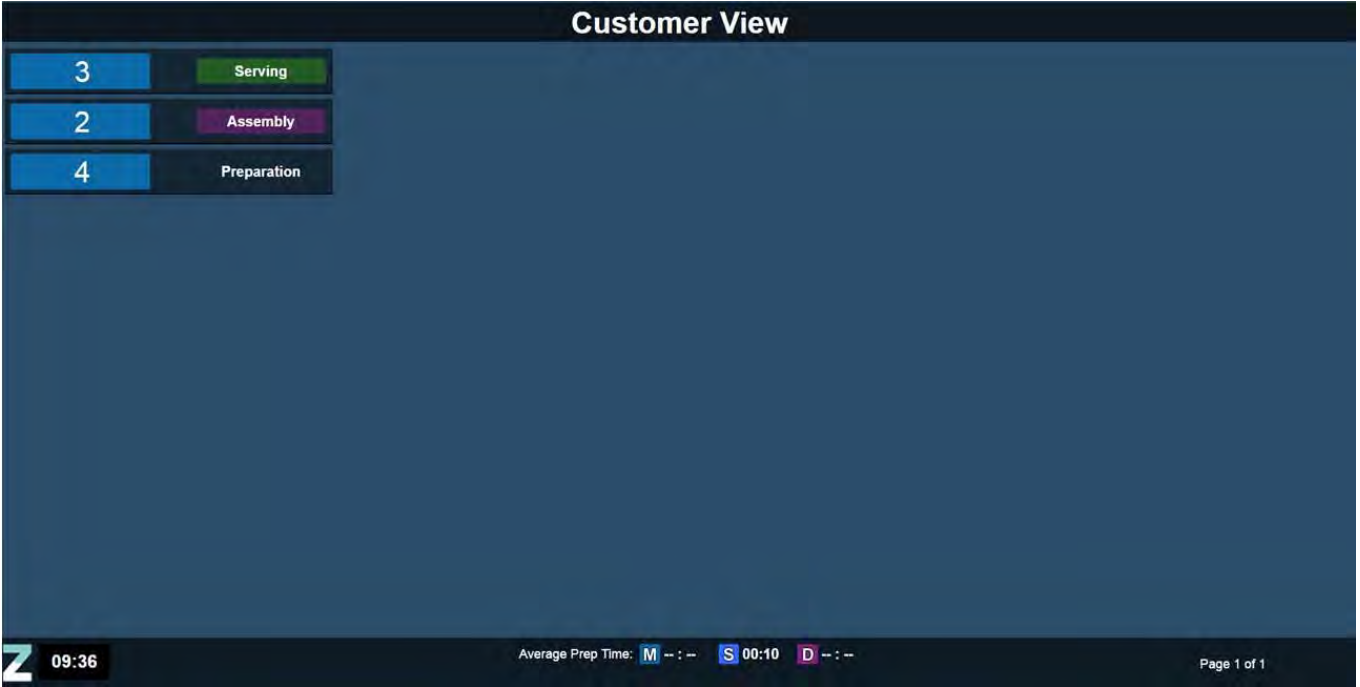
If configured, the customer view can display the following information:
-
Table or account number. Tables are shown in white and accounts in blue.
-
Customer name
-
Number of items in the order
-
Order stage colour
-
Order stage display name
-
Average delivery or prep time in the footer.
Order Ticket View
The order ticket view displays all items that make up a single order on an account along with the following key information in the header:
-
POS Name
-
Server Name
-
Ring up time
-
Table Number
-
Account Number
-
Cover Count
-
Customer Name
-
Delayed Order Time
If the data is not available to populate these fields, the labels are hidden from view as shown below:
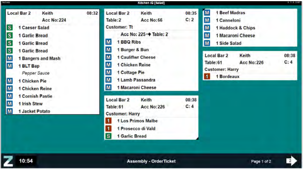
The order ticket view will display 3 columns on 19" screens and 4 columns on 22" screens.
Tickets are displayed in the order they were rung up with the course icon displayed alongside each item in the order. Items that are active, on manual hold or on system hold are not differentiated.
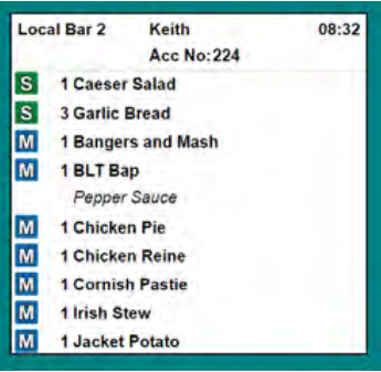
If the view is configured to combine identical items, multiple entries are displayed on one line as shown with "Garlic bread" below:
Reminders and notifications are not displayed in this view.
Cook Times View
The Cook Times View displays items in order of cook times, so the items that take the longest to cook are displayed first. This makes it easier for chefs to co-ordinate dishes so that all items in an order can be ready at the same time.
Cook Times must be enabled for the site in the Configuration app.
The Cook Times view only displays Active, Manual Hold and Cancelled items
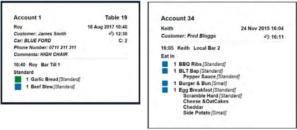
Account Details
Full details of a table or account can be viewed by selecting the item and pressing the Detail button  on the bump bar.
Information displayed is the full list of items currently on the account, regardless if they are visible on the kitchen screen or not.
Entries are grouped by time ordered, then by order destination, then by course and includes:
-
Account and/or table number.
The ‘Table’ prefix is defined in the Configuration app. -
User name and date/time order details view was requested and displayed.
This time may be displayed in 12 or 24 hour clock format depending on how it is set up in the Configuration app. -
Customer name (if provided)
-
Customer Details (if configured and provided)
-
Delivery time (if provided)
-
Cover count (if provided)
-
Item names including portion sizes and child lines
-
All order status and order destination information
-
Message actions
The following screens show two examples of Account Details screens:
Select the Details button  a second time to return to the default view.
The information displayed is correct at the time the order details view is displayed but subsequent changes of account or item status are not displayed until the order details view is closed and reopened.
Grouped items
If the Group Table Orders option has been enabled and a Grouping Period has been defined at head office, new orders added to a table or account within the defined grouping period will be grouped together to keep tickets of the same order destination/course and table/account number together.
Orders for the same table/account will be prioritised over orders taken for other tables if they are taken within the defined grouping period.
Once orders are grouped, the table number will be displayed with the same background colour as the timer to indicate it is newly added and will revert to its normal colour when the timer does.
Grouped tickets will have less space between them to provide an instant visual indication of their group status.
Both examples below show the top two tickets grouped together because they have been rung up on the same table number/account number within the defined grouping period.
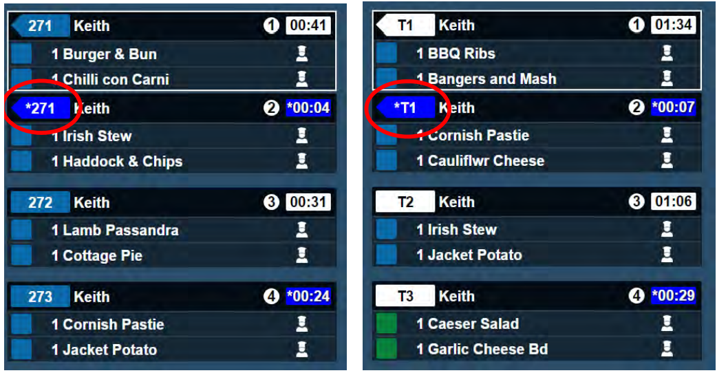
When table or account numbers are grouped, the indicator becomes pointed on the left-hand side and when the timer displays the ‘new item blue’, the table number displays an asterisk (*) before the number and flashes blue.
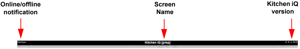
Screen Header
Common to all types of view, the header bar contains the following information:
Screen Footers
The footer in all views contains key information for the user.
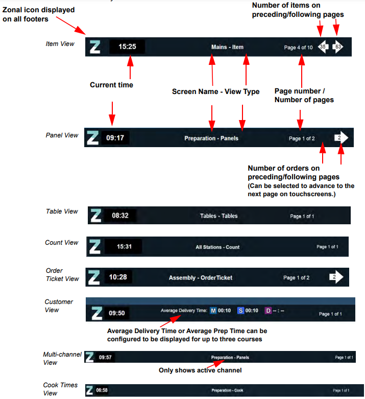
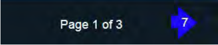
If there are too many orders to display on one page, an indicator is displayed in the bottom right-hand corner of the page to indicate how many orders (Panel and Order Ticket view), items (Item, Count and Cook Times view) or tables (Table view) are displayed on the following or preceding pages.
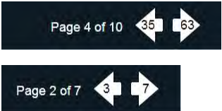
If there are new orders on a following or preceding page, the indicator will be coloured blue
To move forward a page, use the cursor to move to the last order on the current page, a single cursor down operation will then move to the next page.
To move backwards, use the cursor to move to the first order on the current page, a single cursor up will then display the previous page.
A long press of the up or down arrow will take you to the top or the bottom as appropriate.
If touch screen support has been enabled for a selected screen, you can press or click the indicator arrows to advance to the next / previous page.